

Button
The Button element in EComposer allows you to create clear and clickable call-to-action (CTA) areas on your page. It helps guide users to take specific actions, such as:
- Navigating to another page or section
- Triggering an anchor scroll
- Linking to an external website
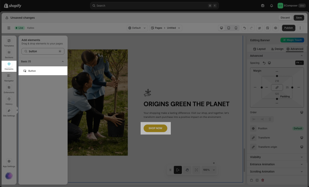
Firstly, on the left sidebar, open the Elements -> Basic tab, and you can drag and drop the Button element anywhere that you want to add content.
1. How to configure a button
Now you can set up the URL, text label, typography, color, hover color, animation, etc. for the button. Please check the video below:
- Button Label: Set the text shown on the button.
- Button Link: Add a link to make the button clickable. Click the Settings icon to configure link options:
– Link: Select a page from your store or enter a custom URL.
– Link title: Tooltip text shown on hover.
– Open this link in a new tab: Enable to open the link in a new browser tab
– Add nofollow: Add anofollowtag to the link (for SEO purposes).
– Custom attributes: Add any custom HTML attributes for advanced usage. - Button ID: Assign an ID to the button for internal navigation (e.g., anchor links).
- Icon: Add an icon and adjust its position and spacing.
- Button Animation: Apply animations to make the button more eye-catching.
2. How to put a button next to a button
By default, when you drag and drop two button elements onto the page, they will stack on top of each other. If you want to place the two buttons side by side, please follow the video below:
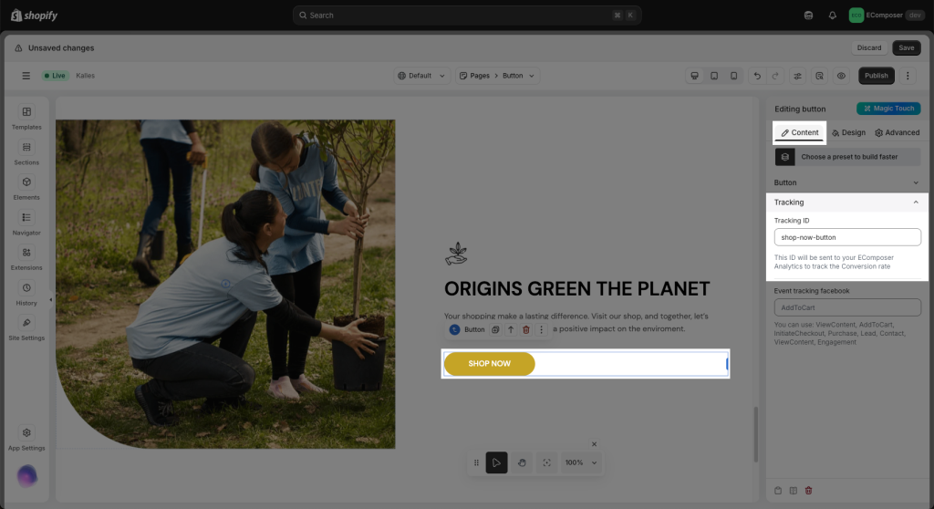
3. How to track a button
- Tracking ID: Add a Tracking ID to the monitor button clicks. This ID will be sent to EComposer Analytics when the button is clicked. Learn more about Analytics
- Event Tracking Facebook: This option lets you track user interactions (like clicks) using Facebook Pixel. It helps you measure and optimize Facebook ad performance by tracking actions taken on your store. You can enter a custom event name (e.g.,
AddToCart,ViewContent, or any name you want to use). When the button is clicked, this event will be sent to your connected Facebook Pixel.
Note: Make sure your Facebook Pixel is already set up on your store to track events successfully.
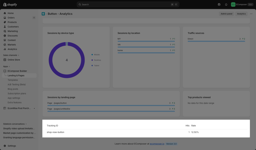
Below is the Analytics result of the button. You can check this document to learn more about the Analytics feature.
4. How to make a trigger button link to a section on the page?
Please refer to this document and try it out! Feel free to ping us via live chat if you need any more help with it.


3 Comments
andrew
Ho do i get a shop no buttom to scroll down to a particular section. i.e. button in section 1 – scroll to section 4
Karl
How do I get a button in the top of my page to scroll down to a section (sign up form) at the bottom of my landing page
Anna Nguyen
Hi Karl,
Please refer to this document and try it https://help.ecomposer.io/docs/faqs/how-to-make-a-button-link-to-a-section-in-the-page/
Feel free to ping us via live chat if you need any more help on it.