

Banner
The Banner element is a versatile UI component commonly used in websites and applications to display important messages, promotions, or calls to action. It typically consists of a background image or color, a text overlay, and a button that directs users to a specific page or action.
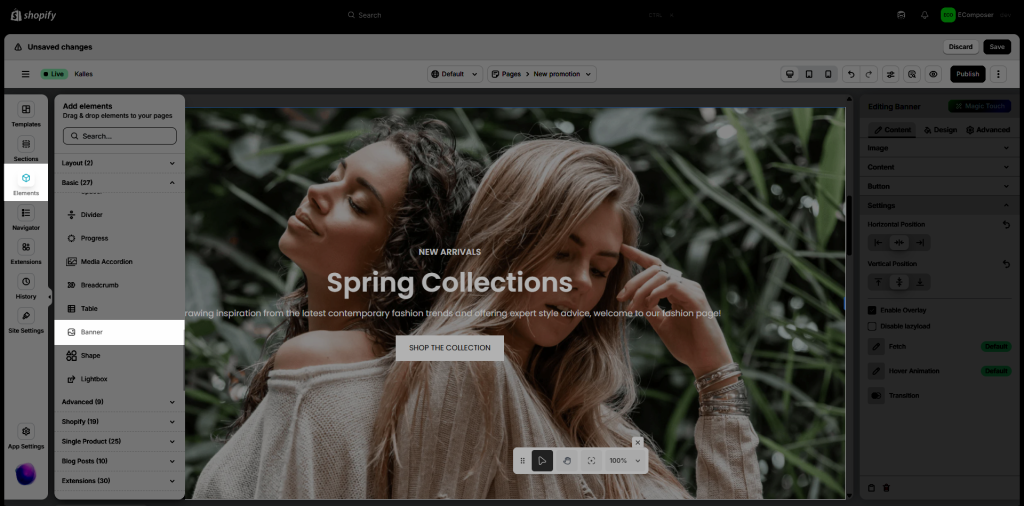
1. How to Access Banner Element
From the left side (Elements tab), you will see the Banner element in the list of elements. Drag and drop it to any position on the page.
2. Configure Banner
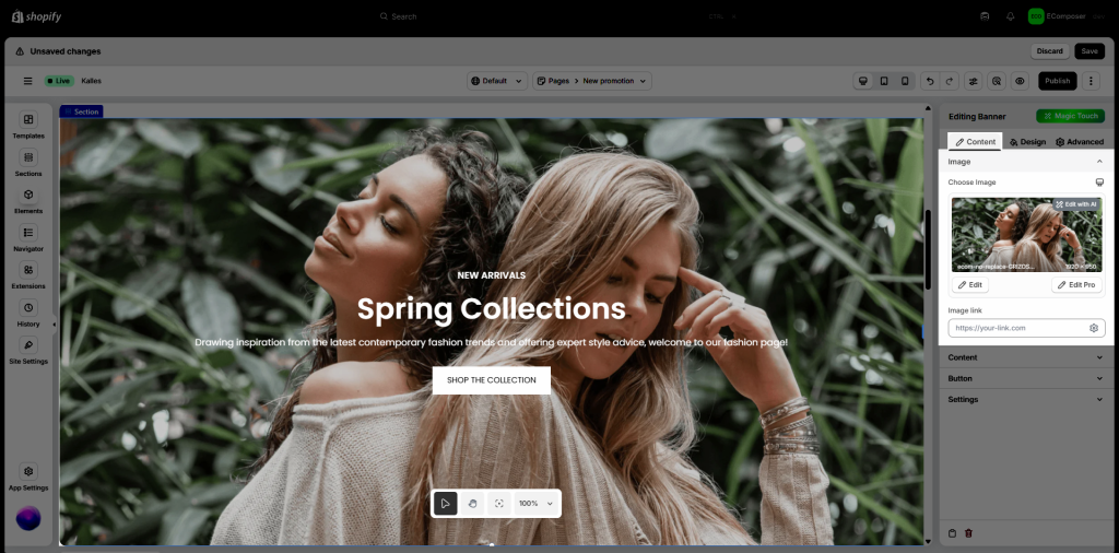
2.1. Content tab
- Image: Define image and image link for Banner
- Choose Image: Here, you can set a banner image for each device you want (desktop/tablet/phone)
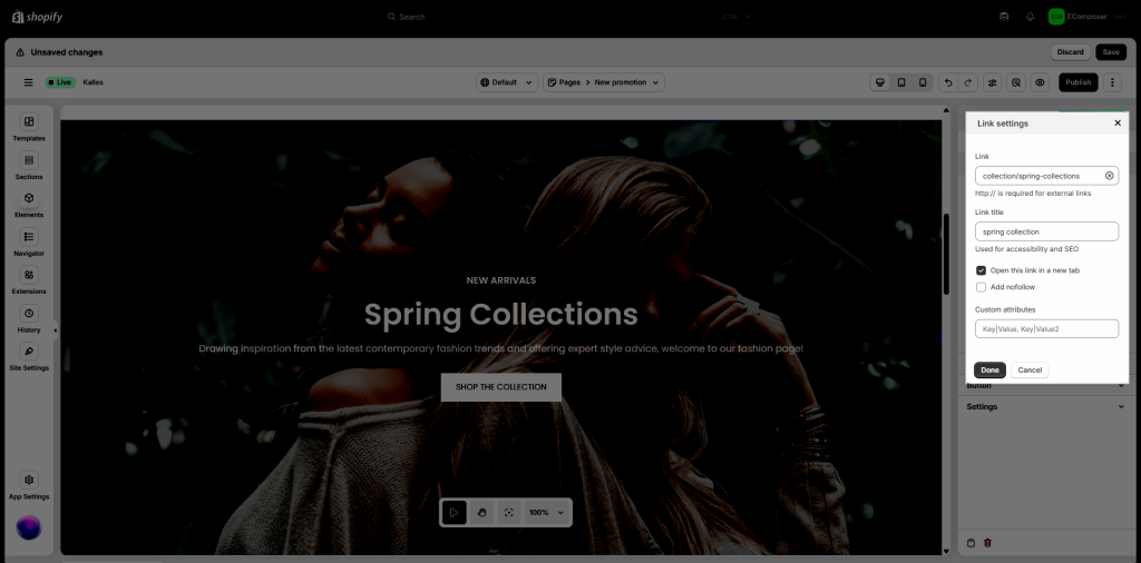
- Image link: Configure a link for the entire Image. You can either paste the URL directly here or click the settings icon to access advanced options:
- Link: Paste a custom URL or select one from available sources.
- Link title: Used to improve accessibility and SEO.
- Open in new tab: Enable this option to open the link in a new browser tab.
- Add nofollow: Adds the
rel="nofollow"attribute to the link. - Custom attributes: Add any additional HTML attributes to the link element.
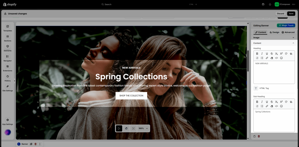
- Content: You can add a Heading, Sub heading, Content for Banner here
- Heading: This option allows you to add a heading of the banner. It could be H1 to H6. Using the correct heading tag helps structure your content properly and improves your store’s SEO by signaling content hierarchy to search engines.
- Sub Heading: same setting for Heading but will be applied for Subheading.
- Content: You can add the details description of the banner in this option.
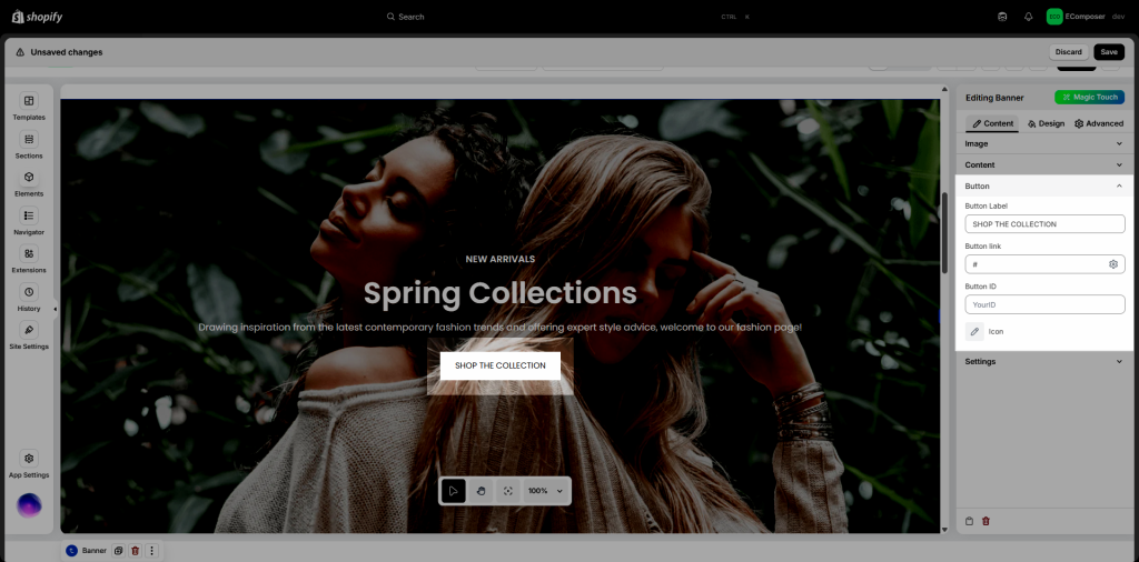
- Button: You can easily add and style a button for Banner.
- Button Label: Add a label for the button as you want.
- Button link: Configure a link for the Button. You can either paste the URL directly here or click the settings icon to access advanced options like the Image link setting here
- Button ID: Add an ID for the button to easily track interactions.
- Icon: You can choose an Icon for button or not.
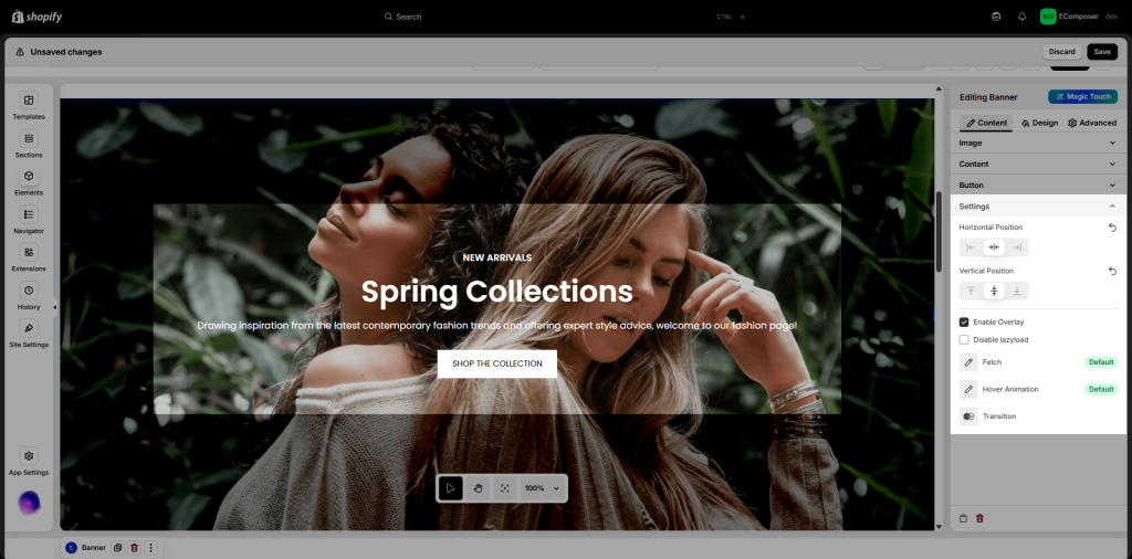
- Settings: Add some configure for Banner as you want.
- Horizontal Position: Specifies the horizontal position of the content within the banner.
- Vertical Position: Specifies the vertical position of the content within the banner.
- Enable Overlay: Turn on this option to enable ovelay for banner.
- Disable lazyload: Lazyload is a web optimization technique that defers the loading of non-essential or off-screen content until it is needed. You can turn on/off it as you want.
- Fetch: The
Fetchproperty of theHTMLImageElementinterface represents a hint to the browser indicating how it should prioritize fetching a particular image relative to other images. It reflects thefetchpriorityattribute of the corresponding<img>element. You have 3 values to choose: Auto, Low, High. - Hover Animation: You can choose a suitable hover animation for yourself when hovering over the banner.
- Transition: You can set some feature for transition such as: Duration, Delay, Timing function.
2.2. Design tab
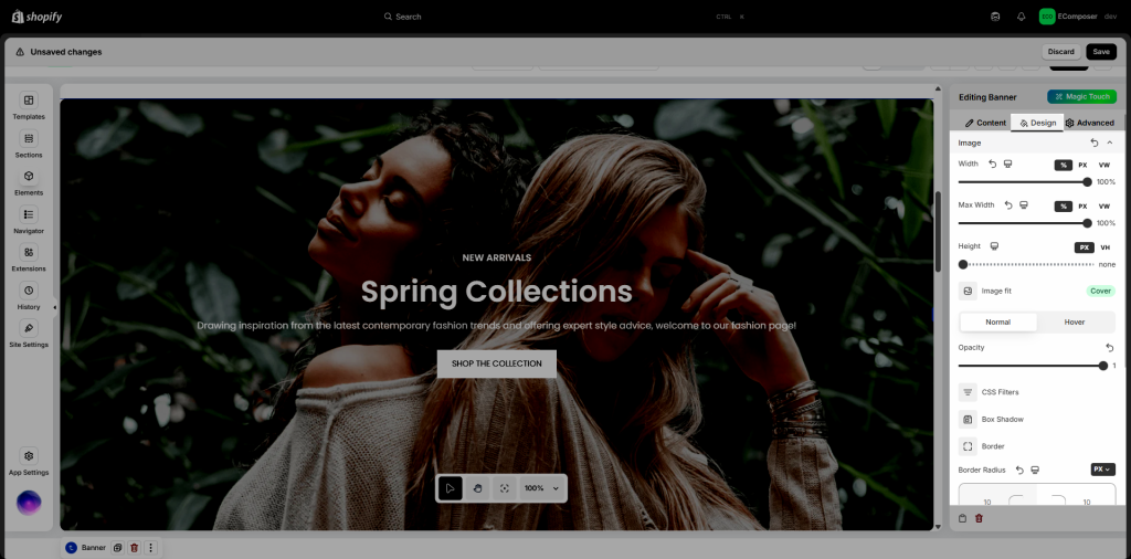
- Image: You can style for Banner image here.
- Width: You can set the Banner image width on Desktop, Tablet, and Mobile
- Max Width: Similarly, you can set the Banner image max width on Desktop, Tablet, and Mobile
- Height: Set height for Banner image on Desktop, Tablet, and Mobile
- Image fit: refers to how an image is resized or adjusted within a container while maintaining its proportions, covering the area, or ensuring full visibility.
- Normal and Hover: Style for Banner image in Normal and Hover state
- Opacity: refers to the transparency level of an image, determining how visible or see-through it appears.
- Css Filters: you can set some attributes for CSS filters such as: Blur, Brightness, Contrast, Saturation, Hue.
- Box Shadow: is a visual effect that creates the illusion of a shadow being cast by an element onto the background. You can set: color, horizontal, vertical, blur, spread, and position for the Banner image box shadow.
- Border: You can configure the border style for Image
- Border Radius: You can configure the border radius for Image
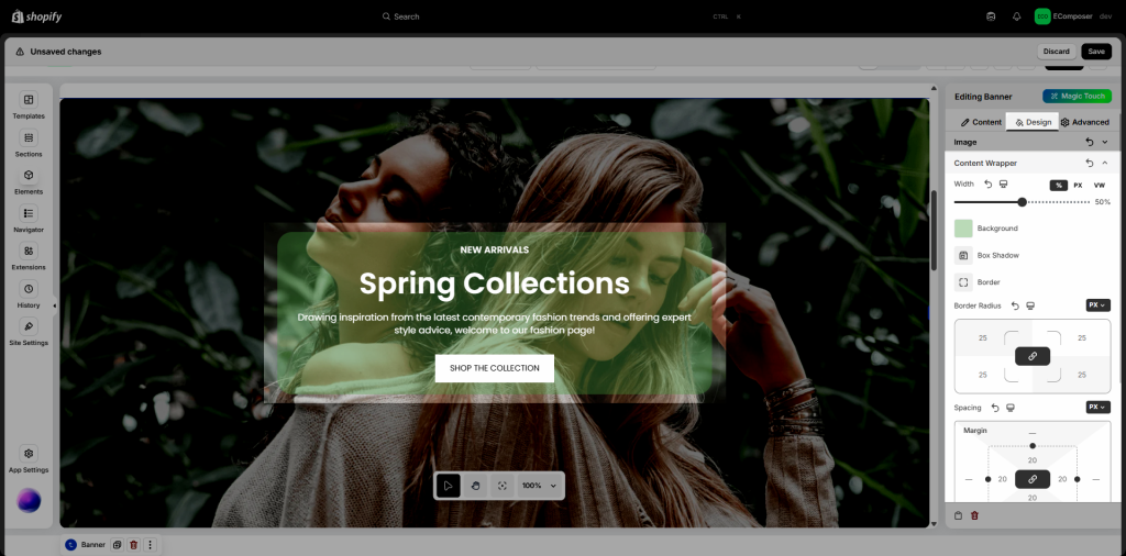
- Content Wrapper: refers to the container or area within the banner image section that holds and controls the positioning, styling, and behavior of the textual and other interactive elements overlaid on the image. You can set Width, Background, Box Shadow, Border, Border Radius and Spacing in this option.
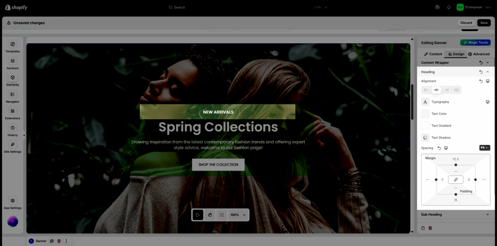
- Heading: Style for Heading in Banner
- Alignment: The Alignment option allows you to control how your heading text is positioned within its container. There are four main choices: Left, Center, Right, and Justify. You can also reset the value or set different alignments for each device (desktop, tablet, and mobile) by clicking the device icon.
- Typography: This option allows you to control the text style of your heading. It includes two tabs:
– Global tab: Uses the predefined styles from your Site Settings, ensuring consistency across your store.
– Customize tab: Lets you adjust typography manually with options like Font Family, Font Size, Font Weight, Text Transform, Font Style, Text Decoration, Line Height, and Letter Spacing.
You can also reset to default styles or set styles for specific devices by clicking the device icon. - Text Color: This option allows you to change the color of the heading text. You can choose a color that matches your store’s branding or helps the heading stand out on the page.
- Text Gradient: This option lets you apply a color gradient to the heading text, creating a visually appealing effect. Instead of a solid color, the text displays a smooth transition between two or more colors, helping your heading stand out.
- The Text Shadow option allows you to add a shadow effect to your heading text. This helps create depth, improve readability, or add a stylistic touch. You can customize shadow color, blur, and position (horizontal and vertical offset) to match your design.
- The Text Spacing option allows you to adjust the spacing around your heading text, such as margin and padding. You can configure different values for Desktop, Tablet, and Mobile by clicking on the corresponding device icons, ensuring your heading looks great on all screen sizes.
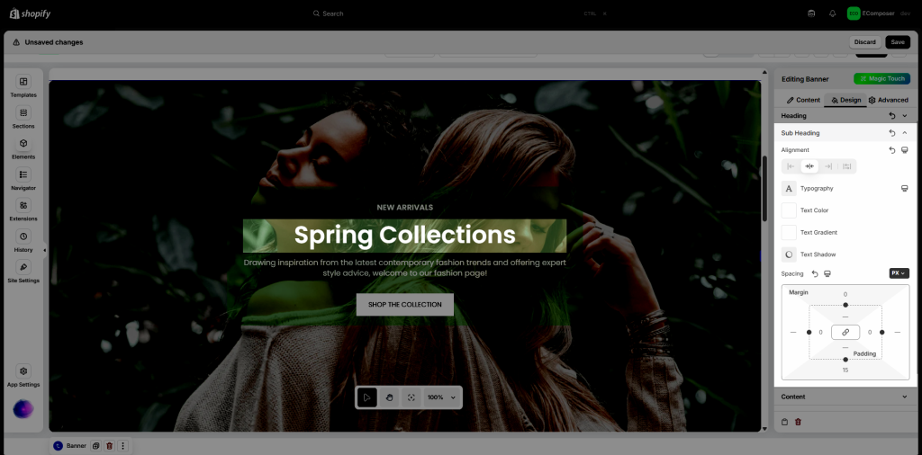
- Sub Heading: same style setting with the Heading option above. You can also set Alignment, Typography, Text Color, Text Gradient, Text Shadow and Spacing.
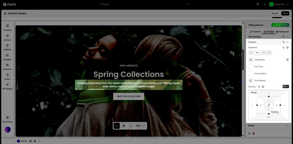
- Content: Style for Content in Banner. You can adjust Alignment, Typography, Text Color, Text Gradient, Text Shadow and Text Spacing.
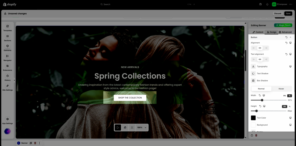
- Button: This section allows you style for button. You can configure Alignment, Text alignment, Typography, Text Shadow, Box Shadow. These settings can be set for both NORMAL and HOVER mode: Width, Height, Text Color, Background, Border, Border Radius, Cursor, Hover Animation, Transition.
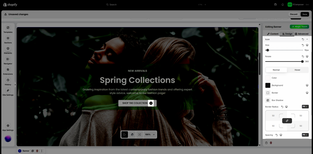
- Icon: Here you can configure about icon size, icon rotate, color, background, border… on both NORMAL and HOVER mode.
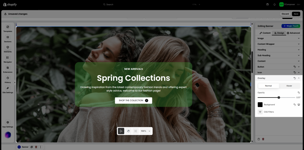
- Overlay: You can configure Opacity, Background, CSS Filters for Overlay on both Normal and Hover state.
2.3. Advanced Tab
You can access details here.


