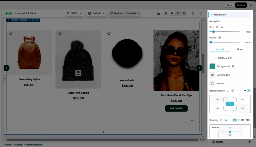
Related Products Element
What do you know about Related? Let’s figure it out with EComposer App.
Related products are basically suggestions that complement the item a buyer is currently looking at. As a result, using these items can significantly boost conversion by encouraging consumers to buy more.
Do you want to know how we end up deciding which products will appear for which searches? Products will show up in the Related Products section without having to be manually selected. And because it is dependent on Shopify, its terms and conditions are listed below (no one can change this).
- Match with the current product type.
- Match with the current product vendor.
- In the same collection with the current product (However, if a product is in more than one collection, there is no way to know which collection’s products will be displayed).
1. Adding Related Element
- Click into Elements –> Single Product –> Related
- Drag the Related element from the left sidebar and Drop it wherever you want it to stay.
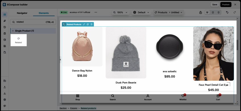
2. Configure Related
2.1. Content
General Settings
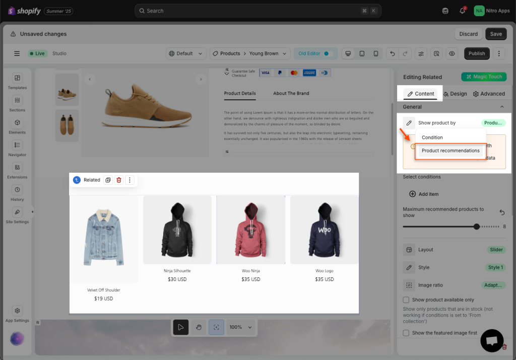
- Show product by:
+ Conditions: Related products will be displayed according to the conditions you select here.
+ Product recommendations: With this option, we will take product recommendations from Shopify to show in EComposer.
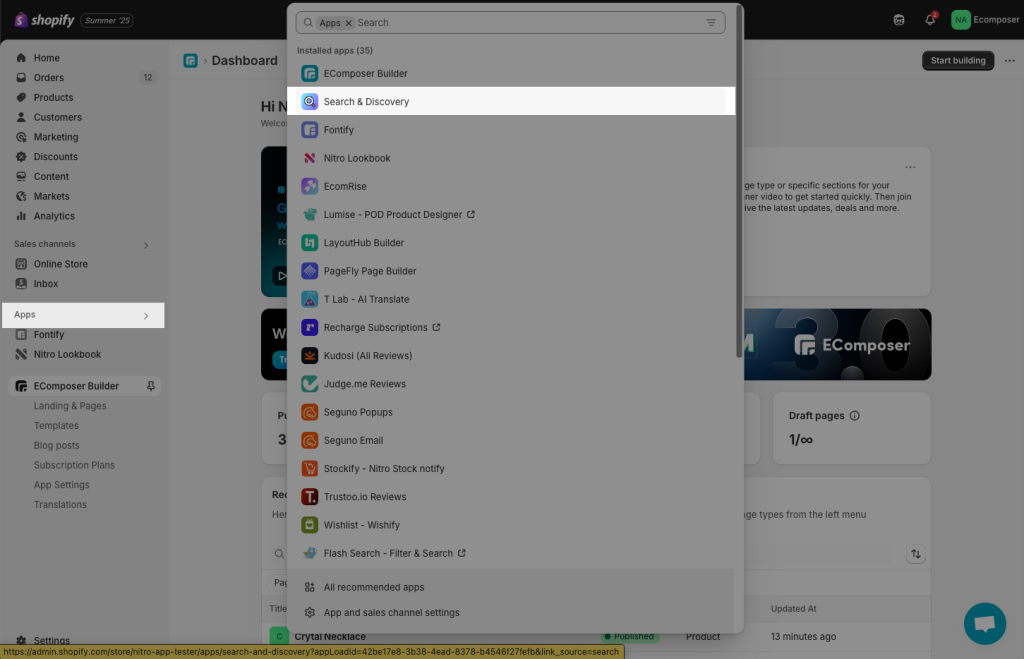
First, you need to install the Search & Discovery app from Shopify app store to your store.
Then, please check the steps video below to pick and set up related products inside this app and show them to EComposer.
Note: The Product recommendation can only show up well on the Live page.
There are some other options to configure for the element:
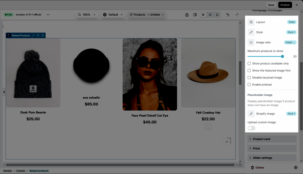
- Layout: This function will help improve your related product view.
- Grid: Your product will be shown up as a grid of cells. Each item will have a certain space between them.
- List: This will be illustrated as a list of the product horizontally.
- Slider: Help you demonstrate your connection product as a slide show.
- Style: You may change the position of the features by indirectly changing their style of it. Whenever you change the Layout, which means the Style will be changed too. There are three different options( Style 1, Style 2, and Style 3) that are waiting for you to view.
- Image Ratio: This feature allows you to set up the percentage of the product photo. There are known as Adapt to image, Portrait, or Square.
- Maximum products to show: Let you set the number of the product that will be demonstrated at the end.
- Show product available only: If you only want to see the available products, you can click on it.
- Show the featured image first: Ensure that the featured image is the first thing users see
- Disable lazyload image: Turn off lazy loading to load all images at once when a page is accessed
- Enable preload: Preload key resources to prioritize their loading for a smoother user experience
- Placeholder image: Display placeholder image if product does not have an image
Product card settings
- Checkbox options: We have options available and you just need to tick the checkboxes to show the short description, vendor, SKU, type, etc.
- Show input quantity: Allow user to add multiple quantity of the products to the cart page.
- Show sale badge: You can set the badge to show as percentage or an exact value, and you can change the text of the badge as well.
- Third-party apps: There are rating, quick view and wishlist apps that you may want to use on your page. To use these apps, please click on the “setting” link to open the setting popup. You must select an app from our app list and install that app to your store to use.
- Show when product contains tags: This is a very nice feature, it helps you to display custom labels on product items through product tags. Eg you want to show the “Hot” label on your product items, please add the “Hot” tag to your product and fill the tag name to this option to show. Watch the below video for more detail.
Price settings
In this section, we show you some options to configure for Price.
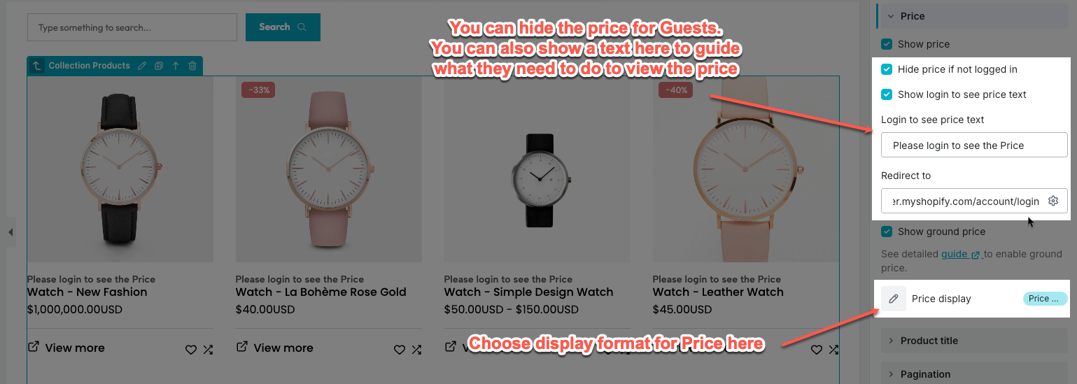
- Show price: You can show Price or not
- Hide price if not logged in: If you only want to show prices to customers who already have an account, this option will help you do that.
- Show login to see price text: If you hide the price for Guests, you can show a text here to guide what they need to do to view the price.
- Show unit price: If you sell products in quantities or measurements, then you might need to display the price per unit for certain products. When you enter a unit price for a product, the unit price is displayed on the product pages, collection pages, cart page, checkout pages, and order confirmation notifications.
- Price display:
- First available variant: Display the price of the available variant of that item.
- Price min: Show the price of that product’s smallest option.
- Price min – max: Display the product’s top and lowest prices based on all variants. Please note the Price min-max option will only appear if the variant is hidden.
Slider settings
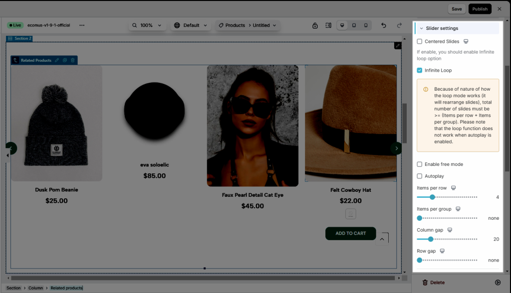
- Infinite Loop: After you go on Autoplay, this function will let you view the slide smoothly as a repeating roll and never stop.
- Autoplay: This allows this element to auto-run and go back to the beginning to play it again and again. Whenever you click on Pause on hover, so the slide will stop when you hover on it.
- And some of them are basically settings for the slide such as Items per row, Column gap, Navigation, Navigator, or Transition duration.
Product title
- HTML tag: you can choose the tag you want (H1, H2, H3, H4, H5, H6, DIV, P)
- Show title on one row: This feature ensures that your titles are displayed in a single line
Product variant settings
- You can go to set some of the basic settings such as Show variant picket, Show variant label, or Show button.
- Add to cart text & icon: You may set a new name for the add to cart button and you can select an icon that you think matches your description
- View more text & icon: You can also type any word for the view more text button, including adding any icon that you want to.
Wishlist & Compare button
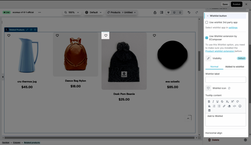
You can Use wishlist 3rd party app or Use Wishlist extension by EComposer
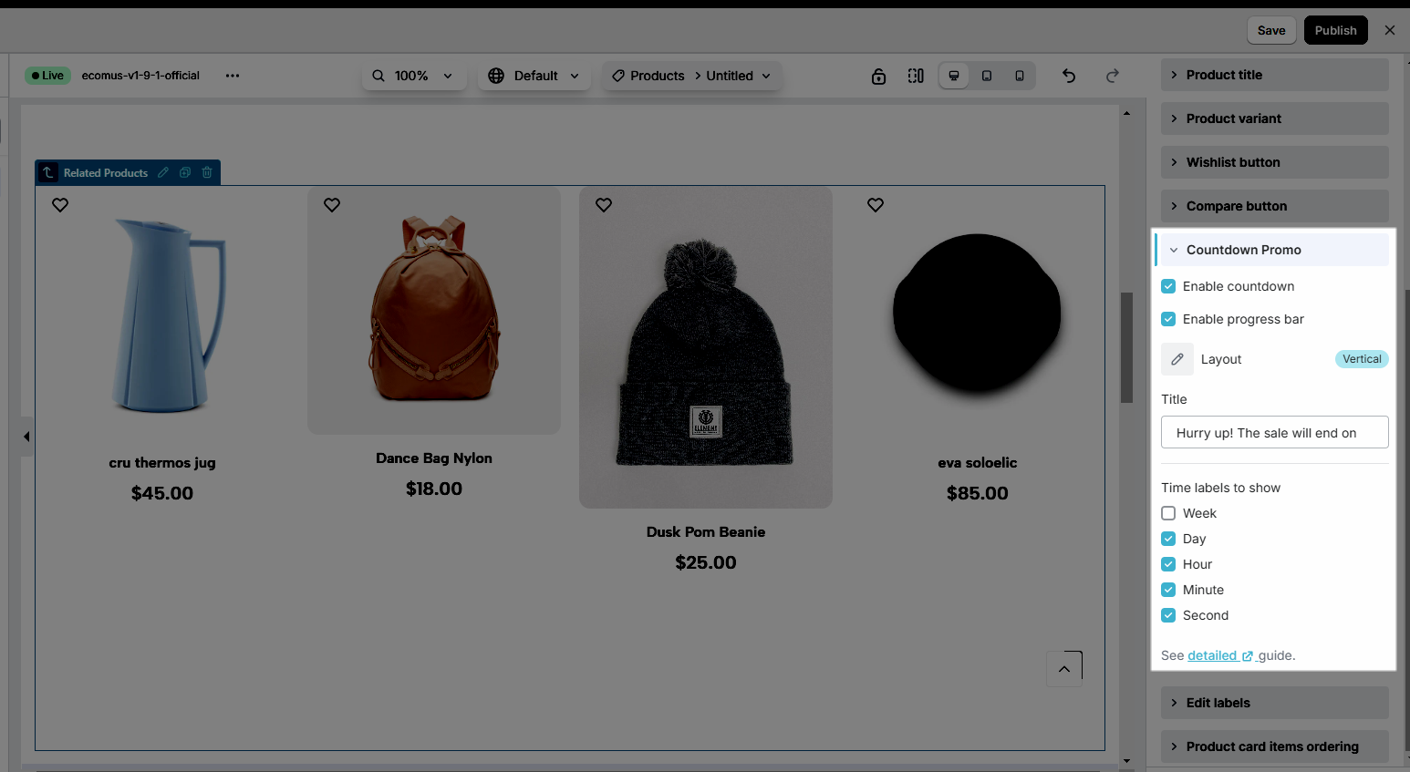
Countdown Promo
- Please go on Enable countdown or Enable progress bar if you have any requests involved with those features.
- Layout: You may set the view for the related product as Vertical or Horizontal.
- Title: Change any word that you think makes sense with your countdown demonstration.
- Time labels to show: You can illustrate many little details such as Week, Day, Hour, Minute, or Second.
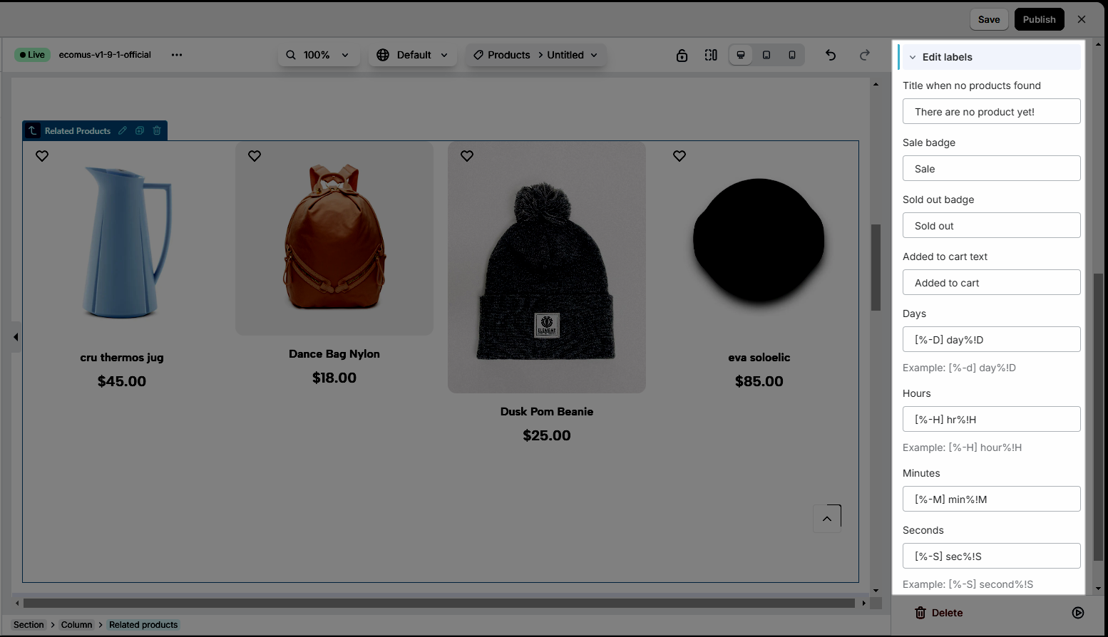
Edit labels
- You allow changing the text or any flexible word of the Title when no products found, Sale badge, Sold badge, Added to cart text, Days, Hours, Minutes, Seconds.
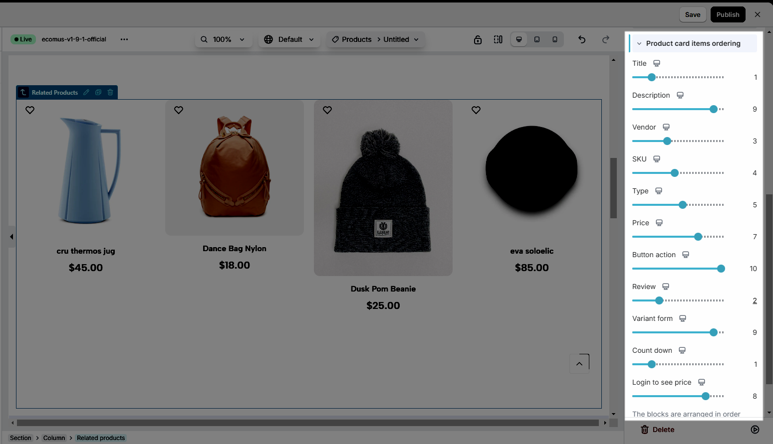
Product card items ordering
- Those features are some of the most important functions that connect with our description, known as Title, Description, Vendor, SKU, Type, Price, Button action, Review, Variant form, Countdown, and Login to see price.
Note: In the EComposer App, you can’t directly edit the element here. It depends on the product or options that you add to Shopify. You can go to Edit Your Product in Shopify Admin to edit this element.
2.2. Design
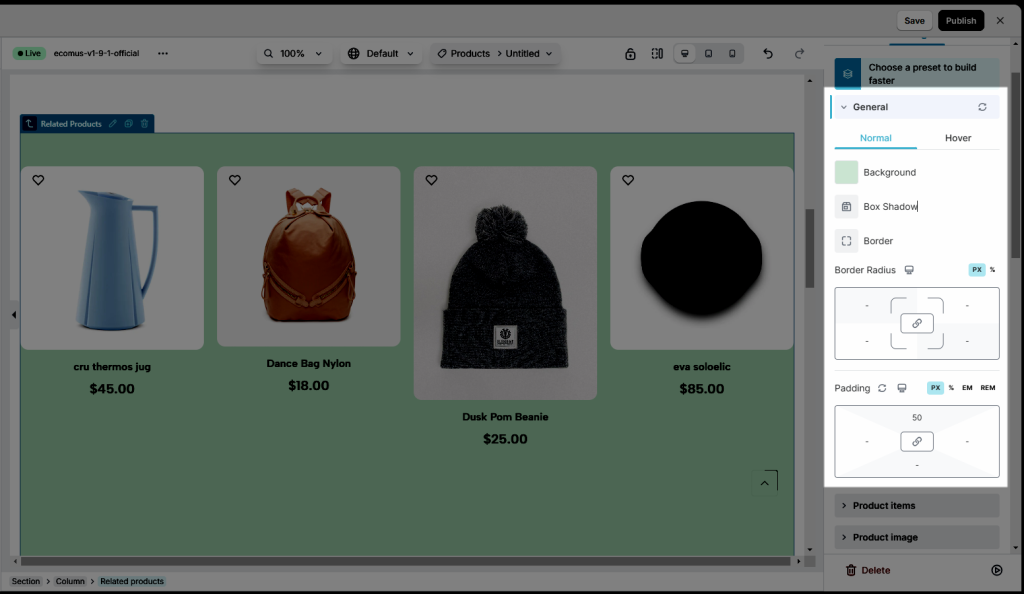
General
- Normal & Hover: you can set Background, Box Shadow, Border, Border Radius, Padding for Related Product element
Product items
- Normal: When you turn it to be a normal function, you may go to change some of the necessary features here like Background color, Border, Box Shadow, and Border Radius.
- Hover: Some of the interests features such as Background color, Border, Box Shadow, and Border Radius, without saying here is Transition Duration, you may set lots of functions like that when you choose hover effect.
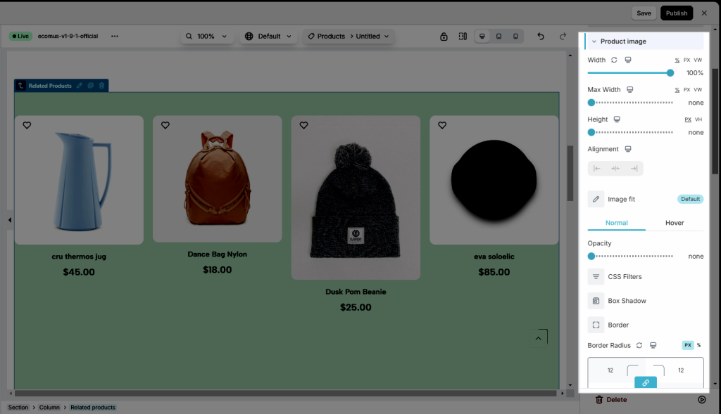
Product image
- You may go first with the basic functions to set Width, Max Width, Height, Alignment, and Image fit for the pictures.
- After that go on Opacity, CSS Filters, Box Shadow, Border, Border Radius, and Spacing.
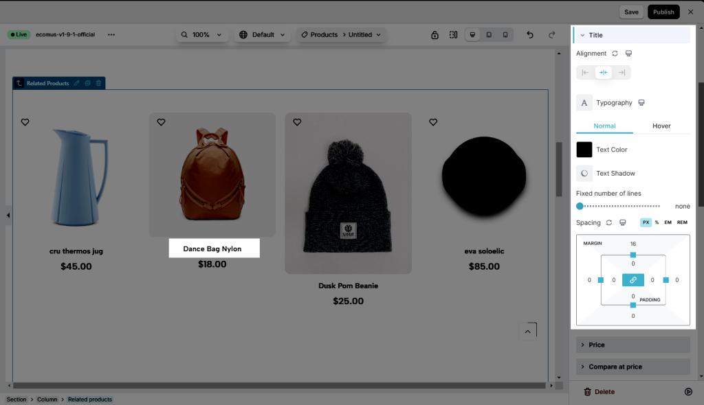
Title
- You can adjust Alignment & Typography
- Normal: set Text Color, Text Shadow, Fixed number of lines, Spacing
- Hover: Some of the features such as Text Color, Text Shadow, Hover Animation, Transition Duration
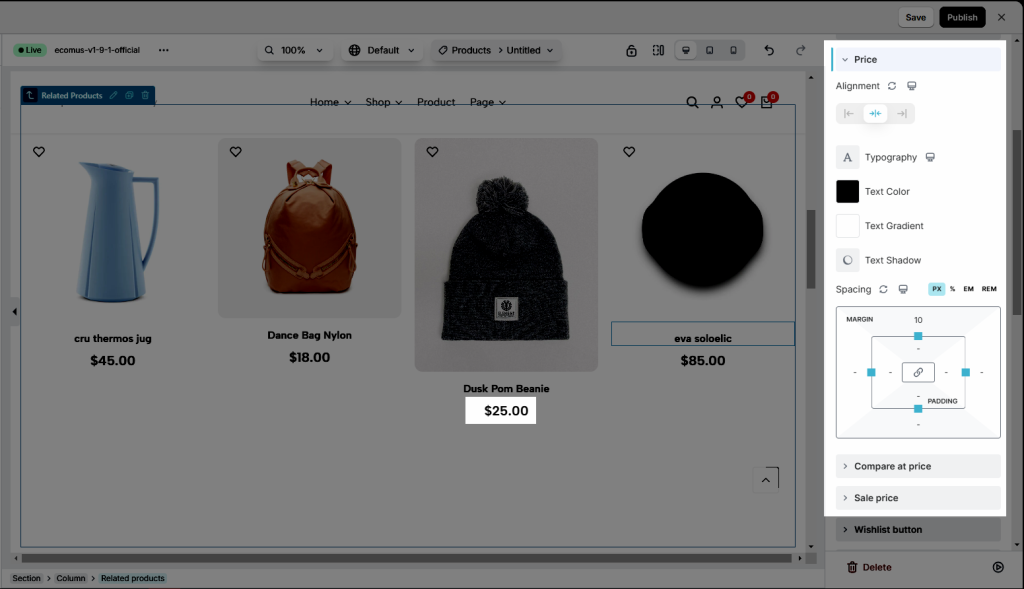
Price, Compare at price, Sale Price
Config Alignment, Typography, Text color, Text gradient, Text shadow, Spacing for Price here
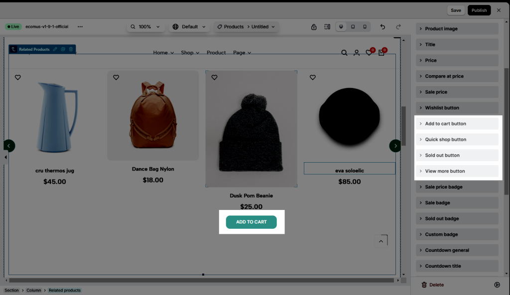
Button
You can style Position, Alignment, Typography, Text Shadow, Box Shadow, Width, Height, Text color, Background, Border, Border Radius, Spacing, Icon size for buttons: Add to cart button, Quick shop button, Sold out button, View more button
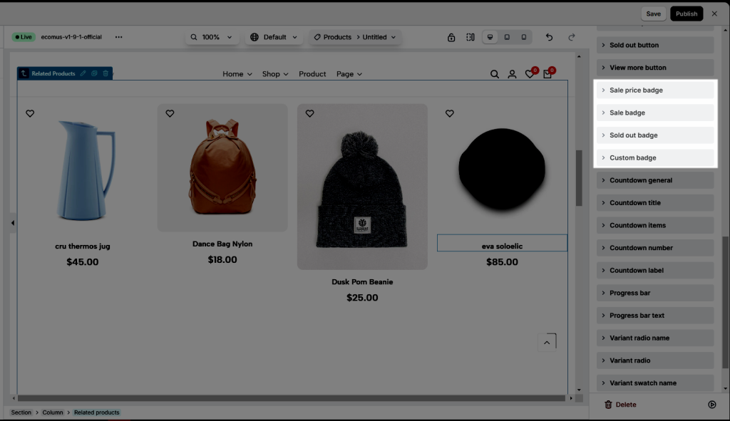
Badge
Config Alignment, Typography, Text Shadow, Box Shadow, Width, Height, Text Color, Background, Border, Border Radius, Spacing for Badges
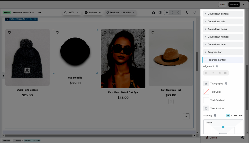
Countdown
Style for Countdown General, Countdown title, Countdown items, Countdown number, Countdown label, Progress bar, Progress bar text
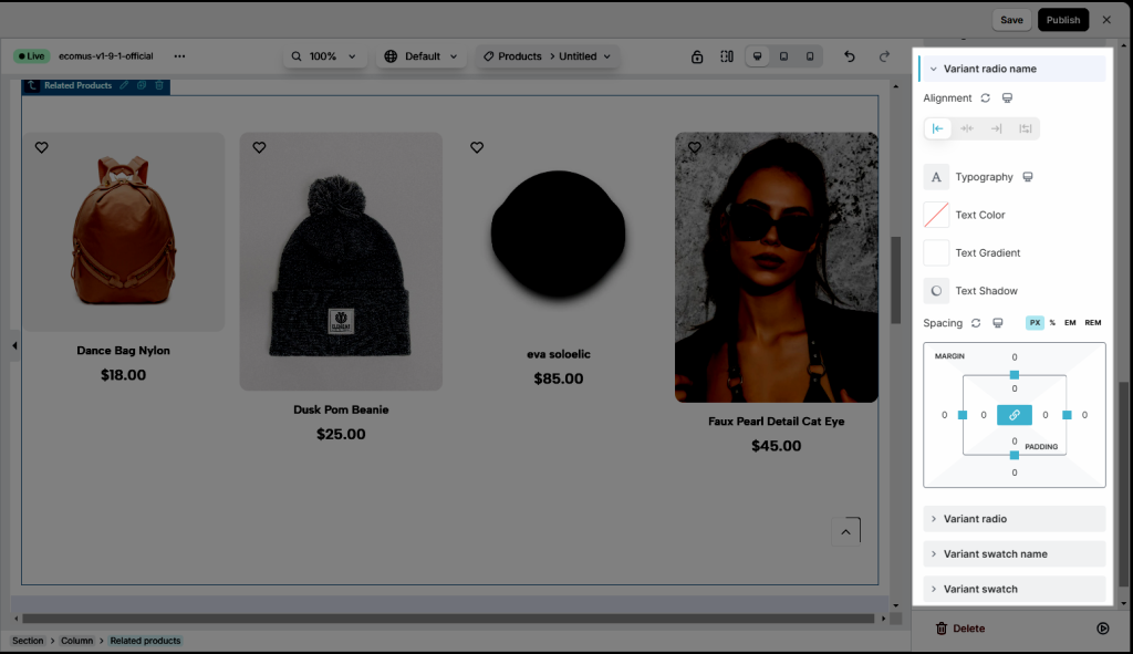
Variants
You also need styles for variants
Navigation
Design Navigation focuses on crafting intuitive pathways for users to explore your website. Config Size, Rotate, Background,…
