Product Compare
The Product Compare extension has finally come in the form of an extension in EComposer. Elevate your shopping experience by effortlessly comparing products side by side, right at your fingertips. No more toggling between multiple tabs or losing track of essential details. It will show a compare icon on your product single and collection pages
1. How to install the Product Compare extension?
To open the Extension popup: From the left sidebar, go to Extensions → search for the extension name and click to install, or click View more to browse all available extensions in the app.
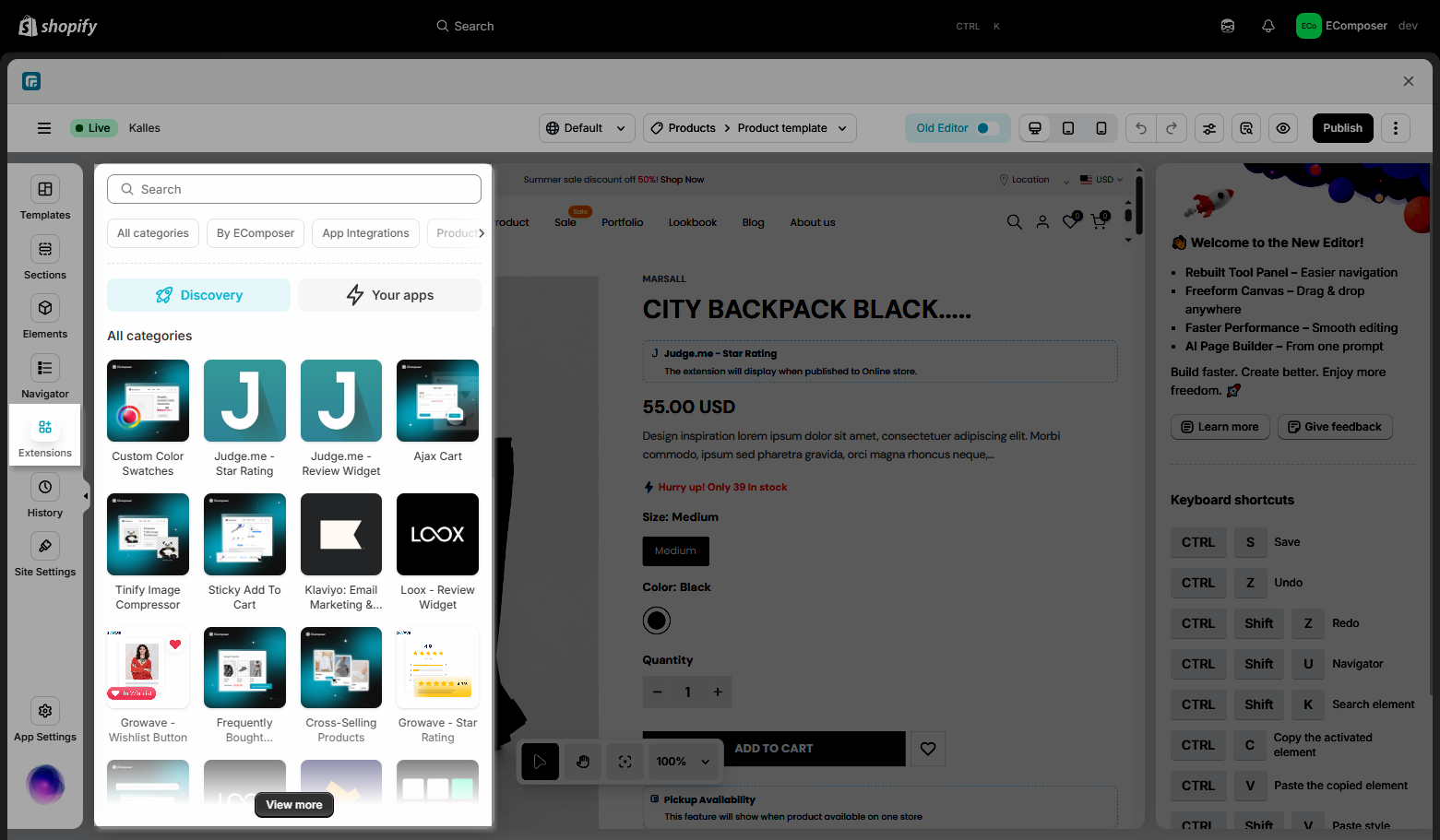
On the Extension popup, you can see the Product Compare extension. Click Install now to install it the right way.
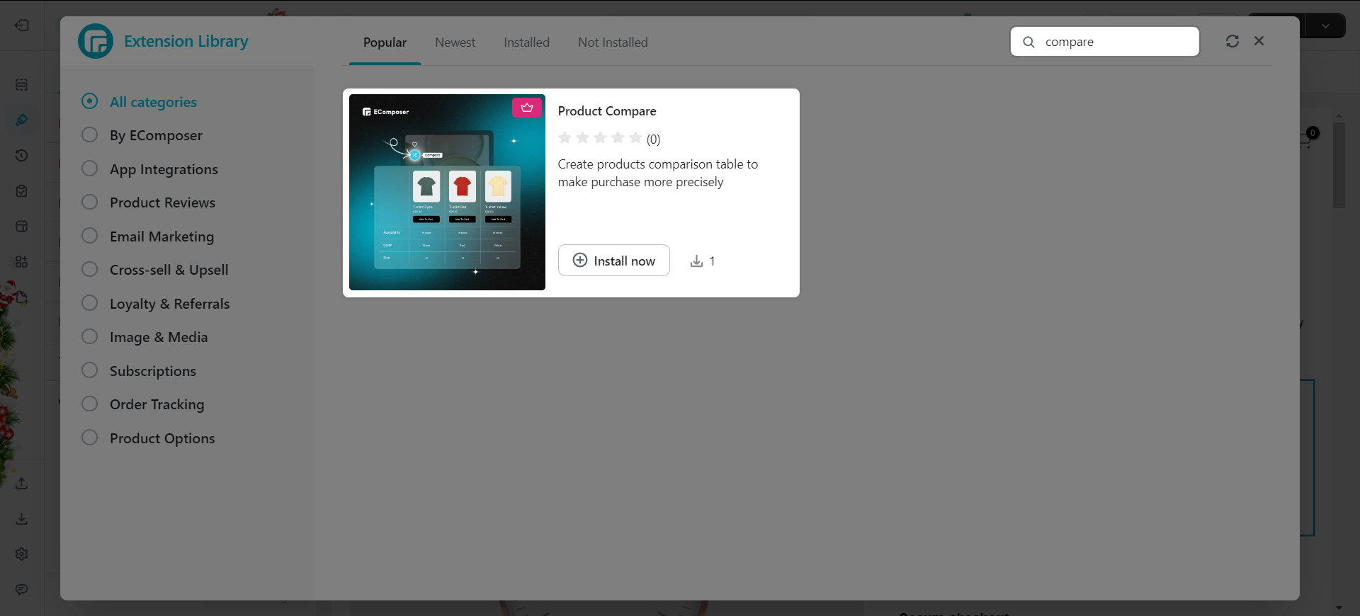
2. Configuring the extension
To add the compare extension to the page, all we need to do is drag and drop the element to the page if we’re on the product template. On the collection template, the compare will be its own option, so we don’t need to drag and drop it.
Next, we can style the extension to how we like, things like changing text or icon color, font size, font family, etc. To understand more, please check out the video below.
Other than the element setting, we also have the extension setting to further the customization. Please take a look at the video below for more details.
3. How to translate the default label
3.1. If your store uses one language and it is not English
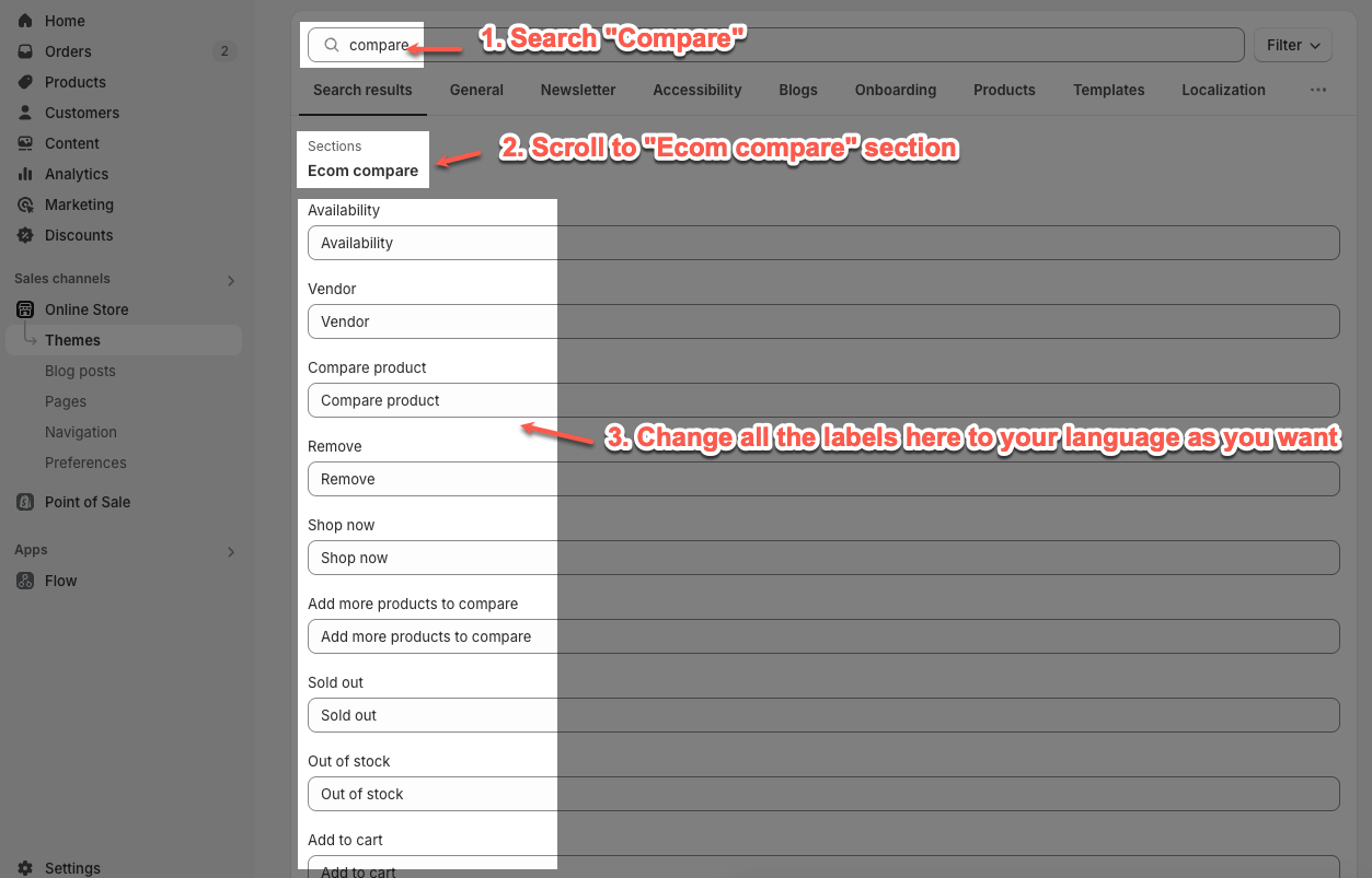
Follow me to translate the extension’s default labels into your language.
Step 1: Go to Online Store -> Themes -> Find the theme working with EComposer
Step 2: Click Edit default theme content
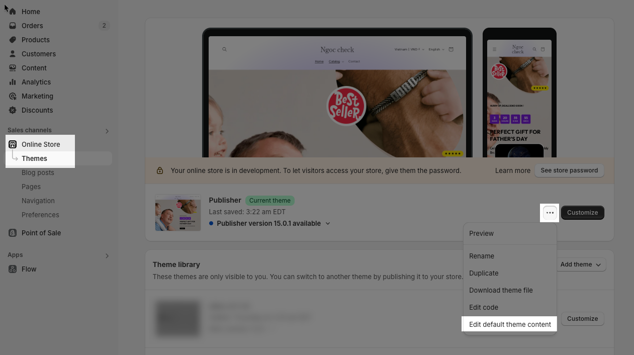
Step 3: Find the extension label and change it as you want.
3.2. If your store uses multi-language
To translate the extension’s label to multi-language, you only need to install a translate app and use it.
We recommend some translated apps such as Translate & Adapt, Transcy, Langify…
Click here to view how to use the translated app.


