Product Grid Simple
The Product Grid Simple element shows a set of products as a grid, a list or a slider. You don’t build the product card yourself. Instead, you choose a ready-made card style, adjust colors, fonts and corner radius, and turn each part of the card on or off. You can’t change the card’s layout, so every card stays consistent and looks finished as soon as you add the element.
Compared with the Product grid element, Product Grid Simple has far fewer settings. Use it when you want a good-looking product grid quickly. Use Product grid when you need detailed control over every part of the card.
You can add Product Grid Simple to any page type: Home, Page, Product, Collection, Blog, Article and Cart, as well as sections and blocks.

1. Add the element
Step 1: Open the page in the EComposer editor.
Step 2: Click + (Add to page) in the left toolbar.
Step 3: Search for “Simple”, or open the Shopify group.
Step 4: Drag and drop Product Grid Simple onto the editor.
The element shows products right away, using the Quick bar card style.

2. Content settings
Click the element on the canvas to open its settings on the right. The settings have three tabs: Content, Design and Advanced. The Content tab has three groups: General (product source and card style), Layout and Elements.

2.1 Product source
In Content > General, use Product source to choose which products the element shows:
- Current collection: shows the products of the collection the visitor is viewing. This is the only source that supports pagination and works with the Filter and Sort elements on the page.
- From collection: pick one collection under Select collection to show. Leave the field empty to show products from all products.
- Specific products: pick products under Select products to show. Products appear in the order you picked them.
Note:1. Current collection is only available on collection pages, sections and blocks. On other page types, use From collection or Specific products.
2. From collection and Specific products don’t support pagination.
3. Specific products shows up to 20 unique products. For more, use a collection.

2.2 Card style
The Product card style field in Content > General shows the name and a short description of the current style.
How to change the card style:
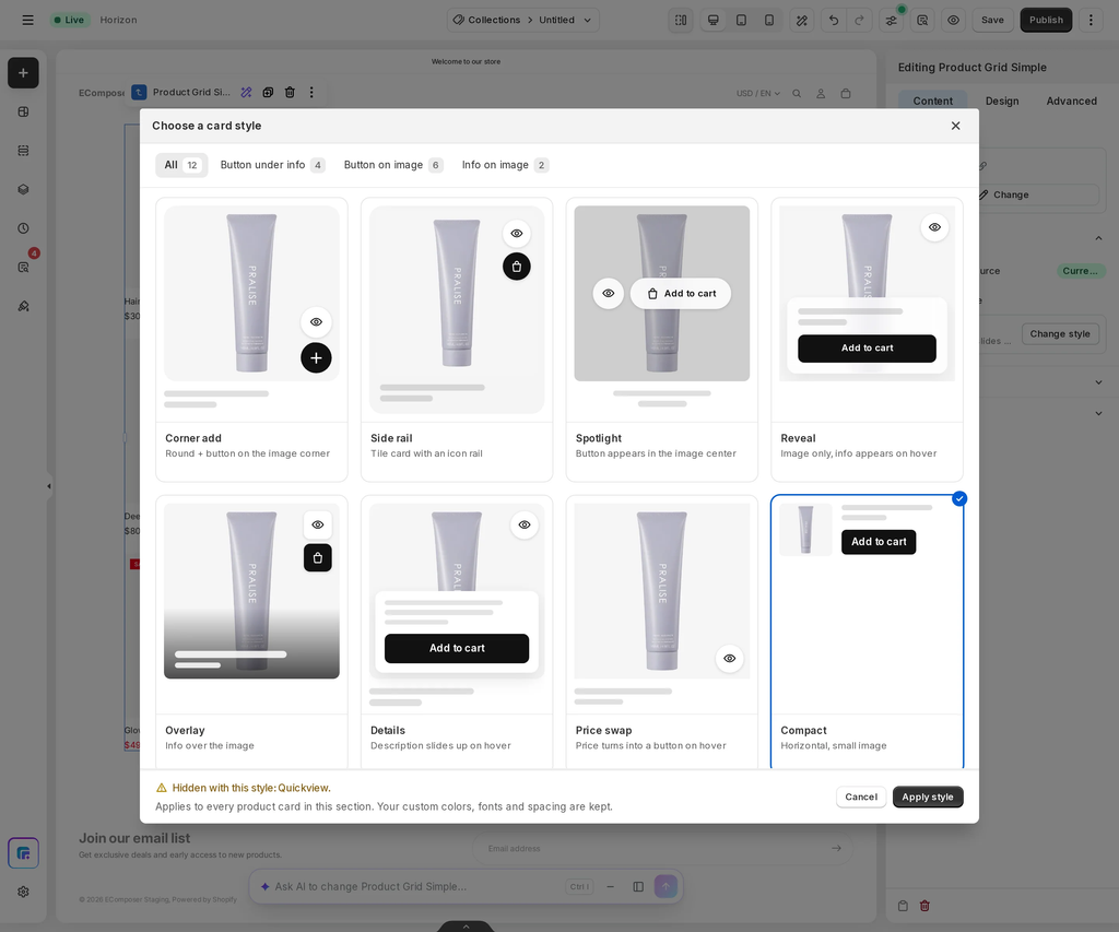
Step 1: Click Change style. The Choose a card style window opens with a gallery of card styles. Each tile shows a live preview card.
Step 2: To narrow the list, click a filter at the top: All, Button under info, Button on image or Info on image.
Step 3: Click a tile to select it.
Step 4: Click Apply style. You can also double-click a tile to apply it right away. Click Cancel to keep your current style.
The window shows this reminder: “Applies to every product card in this section. Your custom colors, fonts and spacing are kept.”
Changing the card style keeps your settings in the Design tab and the on/off state of every option in Elements. Some card styles have no space for certain parts. For example, Compact has no space for a short description or a Quick view button. If the style you selected would hide parts that are currently showing, the window warns you before you apply it, for example: “Hidden with this style: Quickview.” Those options also disappear from the Elements list. Your choices are saved, so the parts come back if you switch to a style that supports them.
Note: You can’t rearrange the parts inside a card. To get a different layout, choose another card style.
Here is how the same products look with the Floating and Compact card styles:
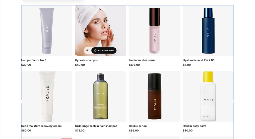
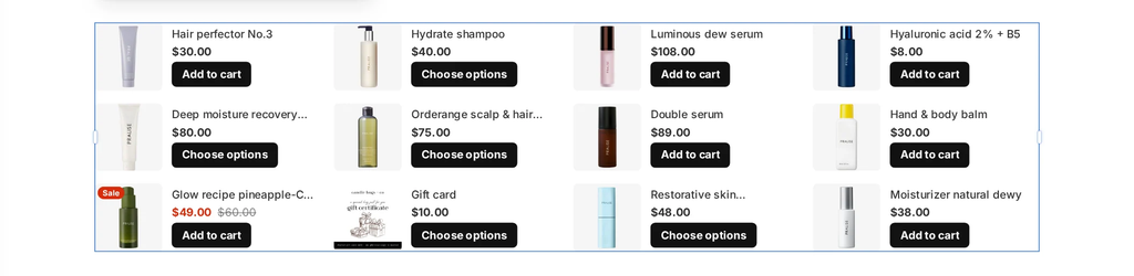
2.3 Layout
Open Content > Layout to set how products are arranged:
- Layout: Grid, List or Slider. List always shows one product per row.
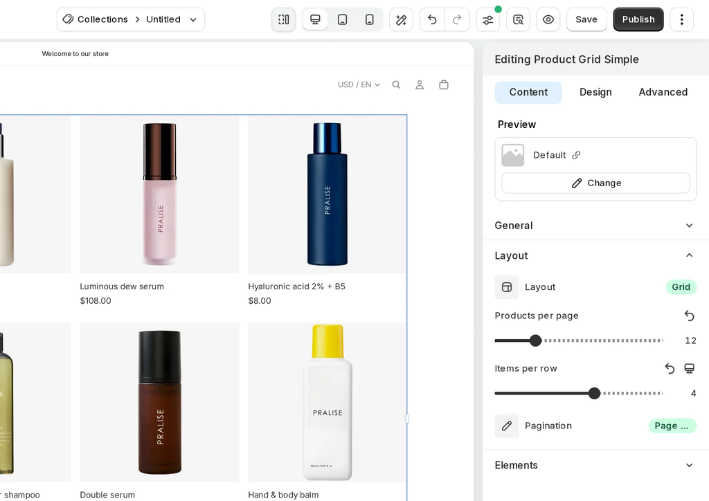
- Products per page / Maximum products to show: how many products to show, from 1 to 50 (default 12). The label is Products per page when the source is Current collection and the layout is Grid or List. It’s Maximum products to show for the Slider layout and for the other two sources, because those show all products at once with no pages.
- Items per row: 1 to 6, set separately for desktop, tablet and mobile (default 4 / 3 / 2). This is hidden for the List layout. With the Compact style, narrow screens show fewer items per row (one on phones).
- Pagination: Page numbers (default), Load more, Infinite scroll or Off. This field only appears when the source is Current collection and the layout isn’t Slider.
Note: The editor previews up to 20 products from a collection. If you enter more than 20, the editor shows: “The editor previews up to 20 products. The live page shows the full number.”
2.4 Elements: turn card parts on or off
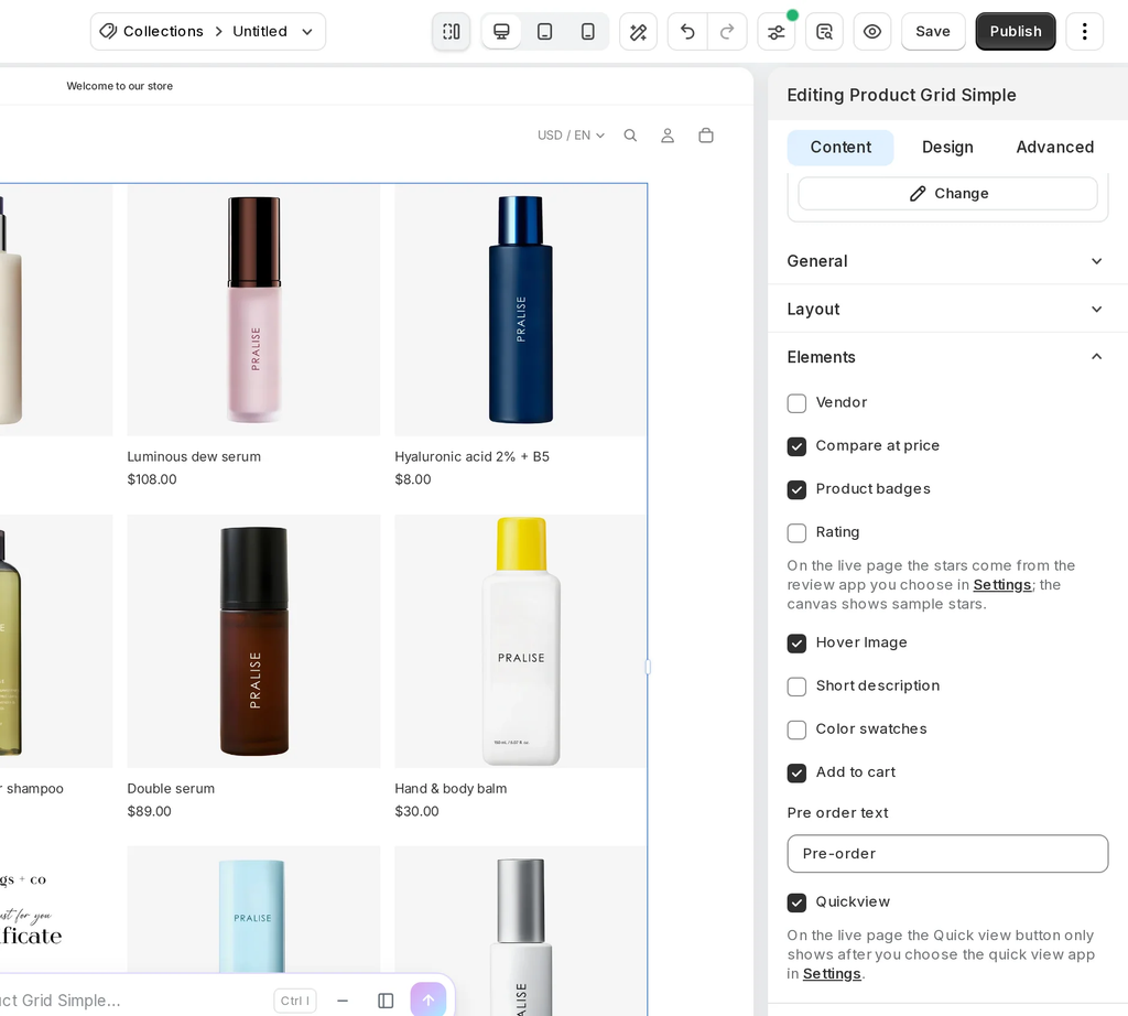
Open Content > Elements. Select an option to show that part on every card, or clear it to hide the part. The list only shows parts that the current card style supports.
- Vendor: shows the product’s vendor (brand) name.
- Compare at price: shows the original price, crossed out, next to the sale price of discounted products.
- Product badges: shows a sale badge on discounted products and a Sold out badge on products that are out of stock. Depending on the card style, the sale badge shows the word “Sale” or the amount saved.
- Rating: shows the product’s star rating. On the live page, the stars come from the review app you choose in Settings. The canvas shows sample stars.
- Hover Image: shows the product’s second image when a shopper hovers over the card.
- Short description: shows a short excerpt of the product description.
- Color swatches: shows the product’s color options as small swatches. Up to 4 swatches show on the card; the rest are summed up as “+N”.
- Add to cart: shows a button that adds the product to the cart. When it’s on, a Pre order text field appears below it. This field sets the button text for pre-order products (default “Pre-order”).
- Quickview: shows a Quick view button on the card. On the live page, the button only shows after you choose a quick view app in Settings. View more details about the EComposer built-in Quick view.
Note: With some card styles, such as Reveal and Overlay, narrow images (phones, tablets, or many items per row) show only the product name and price. Vendor, Rating and Color swatches aren’t shown in that case.
3. Design settings
The Design tab sets the look of every card in the element.
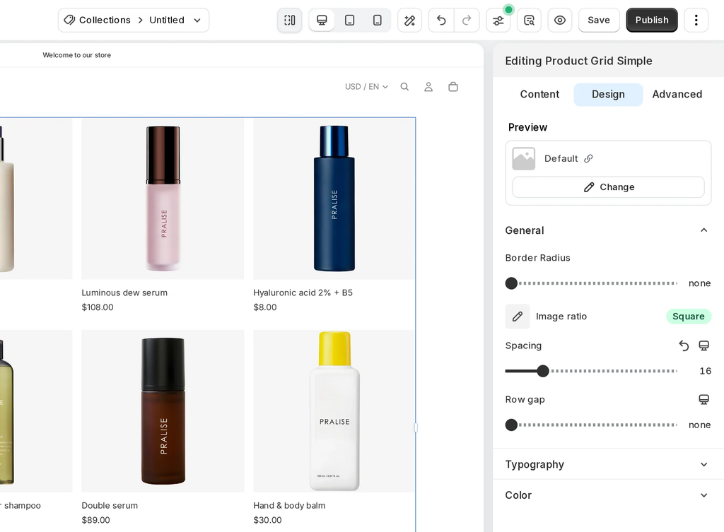
3.1 General
- Border Radius: sets how rounded the corners of each product card are, from 0 px (square corners) to 40 px.
- Image ratio: Square (default), Portrait, Landscape or Adapt to image.
- Spacing: space between cards, 0–80 px, per device (default 16 / 12 / 8 px).
- Row gap: space between rows, 0–80 px, per device. This is hidden for the Slider layout.
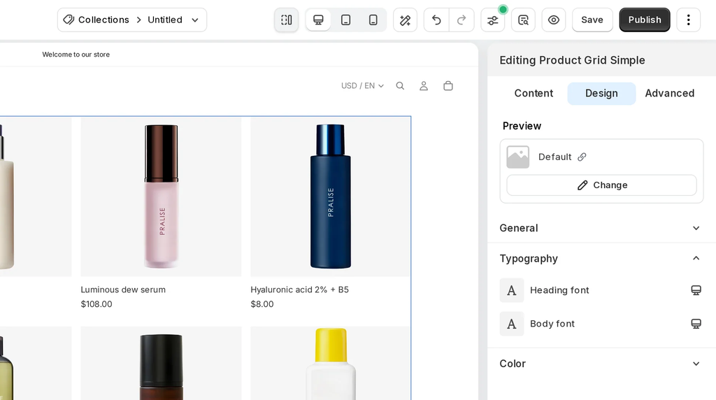
3.2 Typography
- Heading font: sets the font and text style of the product title, such as font family, size and weight. You can set it separately for desktop, tablet and mobile.
- Body font: sets the font and text style of the rest of the card text, such as the price, vendor and description. You can also set it per device.
3.3 Color
- Button color: the Add to cart button.
- Button text color: text and icons on that button.
- Text Color: text on the card.
- Sale color: sale price and badge background.
- Background Color: card background.
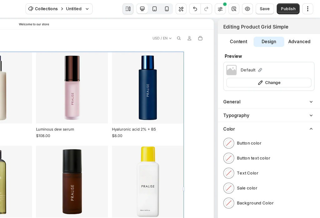
Note: Fields you leave empty use the card style’s own defaults, or your theme’s styles. In the color and font pickers you can also choose a color or font from your Global Style.
4. Advanced settings
The Advanced tab has the same settings as other elements: spacing, position, background, visibility per device, animation, custom attributes and display conditions. See Element Fields – Advanced Tab.
5. FAQs
- Why don’t I see the Pagination setting?
- Pagination only appears when Product source is Current collection and Layout is Grid or List. From collection, Specific products and Slider show all products at once.
- An option disappeared from Elements after I changed the card style. Why?
- The new card style has no space for that part, so the option is hidden. Your choice is saved. Switch to a style that supports the part and it comes back.
- Why is Current collection missing from Product source?
- It’s only available on collection pages, sections and blocks. On other pages, use From collection or Specific products.
- The Quick view button or rating stars show in the editor but not on my store. Why?
- Choose a quick view app and a review app in Settings. The canvas always shows sample stars and the Quick view button.
- When should I use Product grid instead?
- Use Product grid when you need to change the card layout or style each part separately. Product Grid Simple is for quick, consistent cards with fewer settings.
6. Related articles