
Text
The Text element allows you to add and customize written content anywhere on your page. Use it to create descriptions, introductions, announcements, or supporting information, with flexible options for typography, alignment, styling, links, and formatting to match your page design.
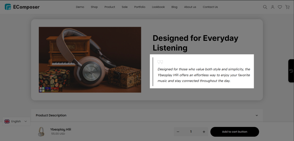
You can find the element in the Elements panel => Basic => Text, then drag and drop it into the page that you want:
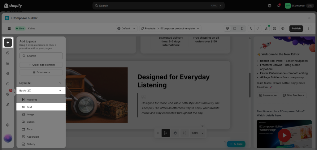
1. How to add a Link to text
The Link option allows you to add a URL directly to the selected text.
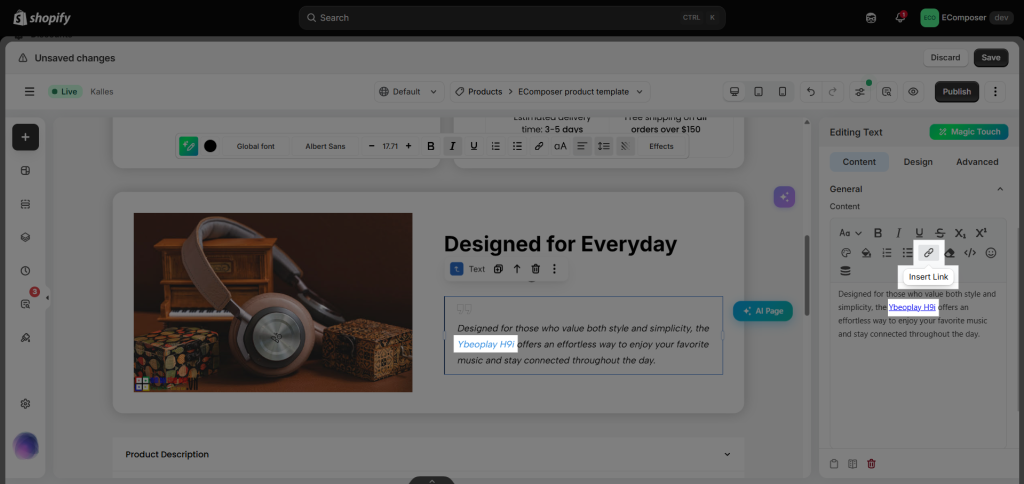
You can follow this video to learn how to add a link to text:
2. How to show View more/ View less button at the bottom of the text
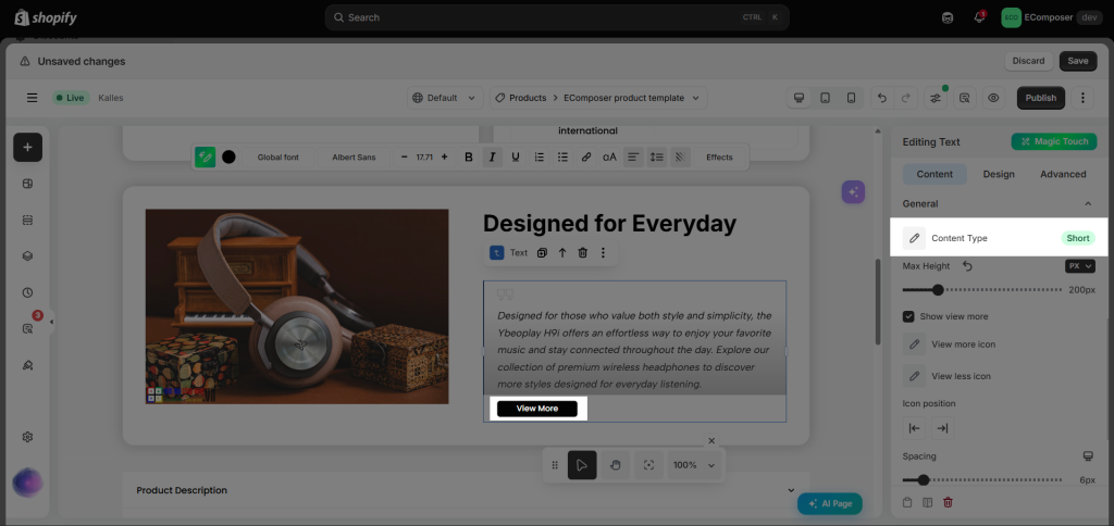
This functionality allows users to expand or collapse lengthy text to improve readability and user experience.
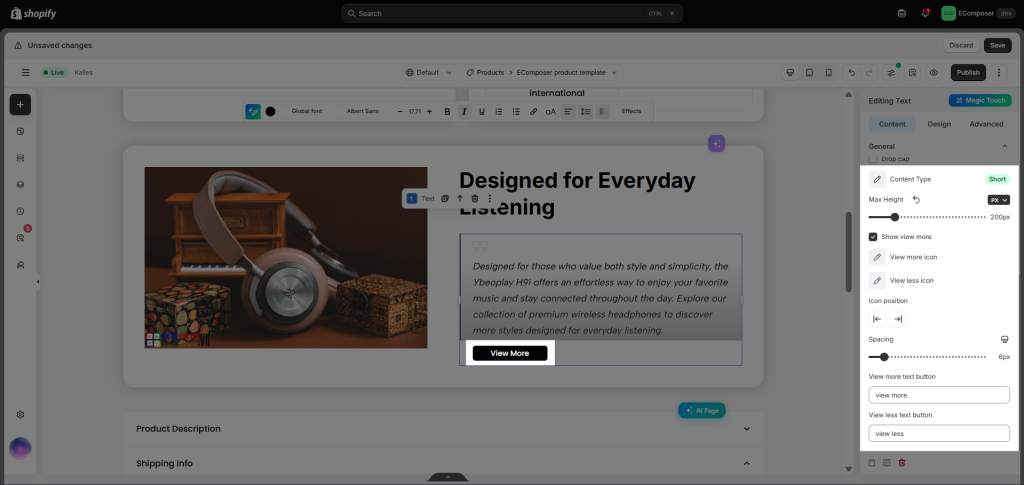
From the Content tab -> choose Content Type: Short
3. How to change the link color
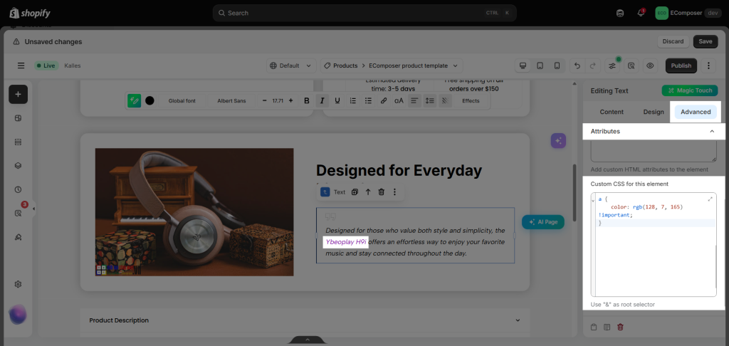
For example, if you have a Text element with a custom link but the link appears in the same color as the normal text, you can change the link color by adding the custom CSS code below to that element.
a {
    color: rgb(128, 7, 165) !important;
}
4. How to Remove custom html/css
If you can’t change the text style using the app’s standard options, the text may contain inline CSS or formatting copied from another source.
Switch to Code View to check for unwanted styles.
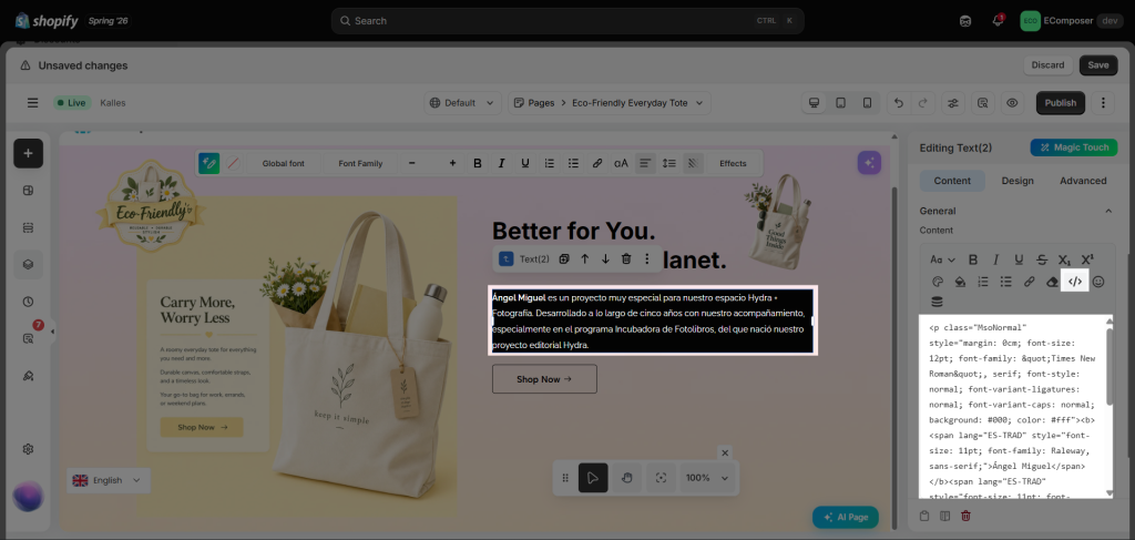
Tip: To avoid this, paste as plain text using Ctrl + Shift + V (Windows) or Command + Shift + V (Mac), then apply styles directly in the Text Element editor.
5. Additional Text Content Options
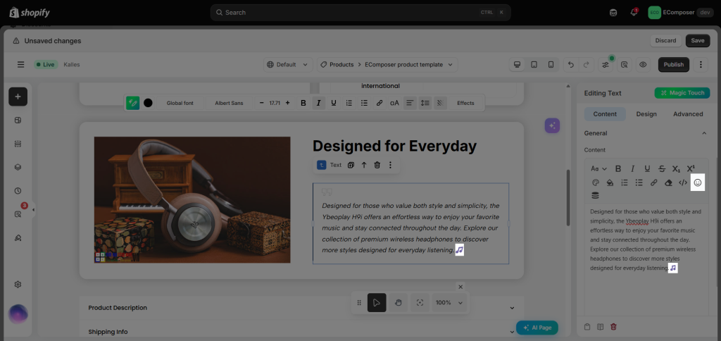
- Emoji: This allows you to select and add your preferred emoji directly to the text.
- Insert Dynamic Content: This will allow you to add Dynamic content as different content based on what you entered for each page.
Here is the video for inserting Dynamic Content from the Metafield:
Here is the video for inserting the Dynamic Content from the MetaObject:
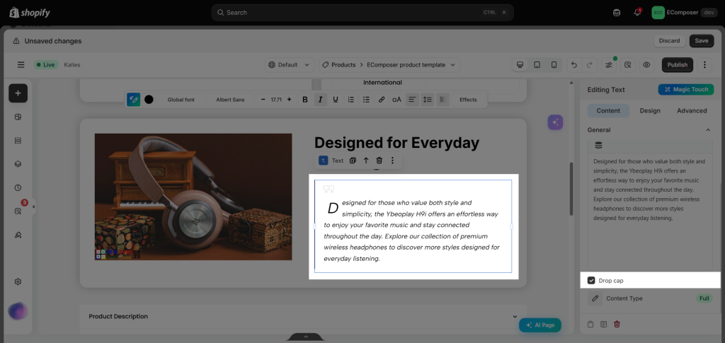
- Drop Cap: Style the first letter of a paragraph.
- Content type: You can choose to show full content or short. If you decide to show short, you can show the View More and View Less buttons, including the setting for the content as Max height, Show View More button, etc.
6. How to style the Text element
You can change the Alignment, Typography, Text Color, Border, and Spacing of the content inside the Text element.
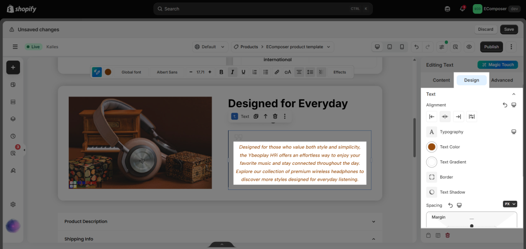
If you set the Content Type to Short, you can customize the appearance of the View More and View Less buttons in the corresponding category:
- View More/View Less: Adjust the Alignment, Typography, Box Shadow, and Spacing. In the Normal and Hover states, you can customize the Text Color, Background, Border, and Border Radius.
- Icon: If you add an icon, you can adjust its Size, Rotate, and Spacing. In the Normal and Hover states, you can customize the Color, Background, Border, Box Shadow, and Border Radius.
You can refer to the video below to learn more about the settings: